The Societal Immunity Level Project
A model that calculates how much natural and vaccinal immunity against SARS-CoV-2 exists within a society

It is easy to find out what the vaccination rate is in a country. But it would be wrong to assume that the vaccination rate is also a good indicator of the actual level of immunity against SARS-CoV-2. For one thing, vaccinal immunity is not the only type of immunity. There is also immunity gained through prior infection.
Vaccinal and natural immunity combine to form total immunity. But you can’t just add vaccination rates and prior infection rates together to arrive at the total level of immunity, given that they partially overlap: If there is a 75% vaccination rate and 30% of people have immunity through prior infection, total immunity is not more than 100%. Some people have immunity through prior infection and also got vaccinated. While vaccination will add something to the immunity they already have through prior infection it won’t add nearly as much as it would to a person not previously infected. In addition, neither natural nor vaccinal immunity is perfect, and both wane over time.
There is also the problem that not all cases of infection are recorded and reported. So the number of actual cases is larger — potentially much larger — than the number of reported cases.
And then there is the effect that a new variant such as omicron has on existing immunity. Omicron partially escapes vaccinal and natural immunity.
So to come up with a good estimate of what the actual level of immunity in a society is, all these factors and more need to somehow be accounted for.
The Societal Immunity Level project aims to do just that. The model provides automatic estimates for the immunity levels in a country, and the extent to which natural and vaccinal immunity contribute to that overall level, based on:
- Data: Reported cases and vaccinations (daily, total, doses 1, 2 & 3, population size)
- Quantitative assumptions:
- underreporting factor: how much smaller than the actual number of cases is the reported number of cases
- time between doses: the average time between dose 1 and 2, and dose 2 and 3
- natural and vaccinal immunity effectiveness: how the effectiveness of natural and vaccinal immunity increase, peak and wane over time
- top-up immunity: the extent to which vaccinal immunity adds to immunity through prior infection
- immunity evasion: the extent to which omicron evades natural and vaccinal immunity
These assumptions are necessarily guesstimates and simplifications, and as such very much open to debate.
The most important variable in estimating overall immunity levels is the degree to which cases are underreported. For example, if in reality 40% of all cases are reported and hence are counted as ‘daily cases’ but the model assumes only 20% are, then the model will greatly overestimate natural immunity levels, and hence overall immunity levels.
But it is also difficult to get a good sense of this underreporting factor in individual countries or provinces. Data about the number of tests per thousand people that are conducted every day may provide some indication of the underreporting rate — if suddenly twice as many people get tested as the day before, then even if the number of actual cases in society is the same as the day before many more cases will be reported — but it cannot be understood as a general rule. For example, the causal relation may also run the other way: If the virus is more prevalent and more people experience symptoms then more people may get tested and an absolute increase in the number of positive tests may not indicate changes in the underreporting factor.
Positivity rates may also provide some information: Sharp increases in the positivity rate could indicate that the virus has become more prevalent and that an increase in the number of tests would now detect a relatively higher additional number of cases than an increase in the number of tests would if positivity rates had not changed. So the underreporting factor might now be higher than it was before.
But these are at best rules of thumb that may not hold in all situations. Moreover, while they may indicate something about changes in the underreporting factor, they may be less informative about what the underreporting factor actually is in absolute terms.
Seroprevalence research could also provide more information but one of the many big failures during this pandemic has been the relative lack of systematic regular and frequent seroprevalence research.
In general, for realistic estimates of the underreporting factor detailed knowledge about the local situation in countries is required, and providing these for each individual country is beyond the current scope of this project.
What the model offers the user instead is the ability to edit the assumptions that are used — including the underreporting factor — so that the user can replace the assumptions in the template with their own assumptions that may be based on superior knowledge of the local situation in a country. The model will automatically generate new societal immunity level estimates and charts based on these alternative assumptions. The template also provides a clean slate for users to add data for other countries they would like estimates for.
Editing assumptions and adding data is very easy to do. This video explains how.
For national data all the information needed is in the Our World in Data dataset. And Google’s COVID-19 Open Data has subnational data.
Briefly put, all cells in light red in the C column contain editable assumptions, and all cells in light red in columns E:J contain and require data:
- column E: daily reported cases
- column F: total number of vaccinations
- column G: daily cumulative number of people vaccinated (1+ dose)
- column H: daily cumulative number of people fully vaccinated (2+ doses)
- column I: daily cumulative number of people boosted (3 doses)
- column J: population of the country or province
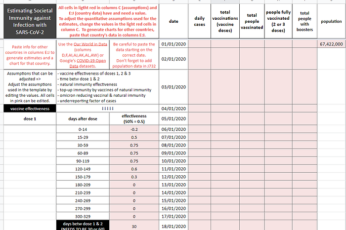
Note that some countries have negative case or death numbers for certain dates. This is the result of data corrections, not resurrections. These negative numbers can be very large and as such they will distort the charts. In the template spreadsheet whenever there is a negative number for daily cases or deaths in the original data, the number for the previous date is automatically used instead.
The data used in this template are for France. Data until March 31 are omitted to make pasting data for other countries easier (data for other countries might start later than French data so if you forget to remove the older French data they would show up in the charts).
In addition to the uncertainties involved in the quantitative assumptions on which the model relies to generate immunity level estimates, there is another reason for not putting too much confidence in the exact estimates the model generates:
We don’t have the actual data for how many days were between doses 1 and 2 of each individual vaccinee. Nor do we have an average time between doses for the population as a whole. We only have the total number of doses 1 and 2 for each day. And we can’t generate the average time between doses from that alone.
But for overall immunity levels within society it matters quite a lot how much time there is between doses.
The model now uses an *estimated average* value (30 days or 60 days). For most countries 30 is used as the default. Some countries, e.g. Canada, opted for an extended period between the first two doses. So for those countries 60 days is used in the model.
But not only are the 30 or 60 days estimates crude and likely not particularly accurate reflections of the more complex underlying situation, they can also cause problems within the model itself, as explained in more detail in the background sheet in the template.
To be sure, this problem likely doesn’t impact the generated estimates in very significant ways. It is for example unlikely to fundamentally change the shape of the curves, the maximum levels of immunity, or the extent to which vaccinal or natural immunity each contribute to it, but it is a non-negligible distortion nonetheless. Any suggestions on how to deal with this problem of modelling the time between doses despite an absence of knowledge about this factor are very welcome.
So:
- Take the specific quantitative assumptions used and the immunity level estimates generated with the appropriate amount of salt, and feel free to experiment with alternative assumptions
- Be aware of the modelling shortcoming when it comes to the ’days between dose 1 and 2’ factor.
Despite these limitations, however, the model can yield interesting insights about general patterns.
Take for example Ontario: With a current 1+ dose vaccination rate of 83.3% of the total population, the current immunity level is only just over 30%. And the large majority of that immunity is due to prior infection, not vaccination.
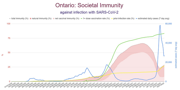
Peak immunity level was around 65% in early October, well before the winter wave was expected to hit. The largest level of vaccinal immunity was in the same period, at about 50%. So in early October vaccinal immunity was by far the largest component of overall immunity. But thanks to waning vaccine effectiveness and the immunity evasion capabilities of omicron, vaccinal immunity has fallen below 10% while the level of natural immunity is now at over 20% thanks to a huge spike in omicron infections over the past two months. That means natural immunity now makes up over two thirds of the overall immunity level in Ontario.
Ontario’s vaccination program, it appears, peaked too early. It provided the highest levels of immunity in some of the months in which it was least needed, ie summer and early fall. And once winter came, not much vaccinal immunity was left. This may explain what otherwise might appear to be a baffling fact: Despite a very high vaccination rate Ontario experienced record high number of cases, hospitalizations and deaths in the past two months.
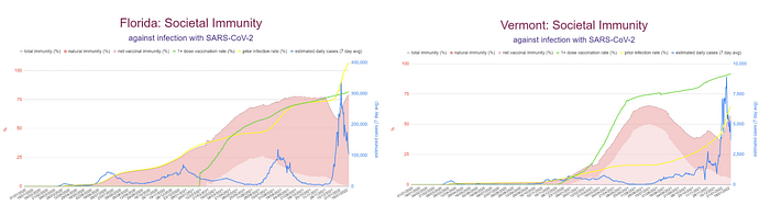
Some other interesting examples:
Florida vs Vermont
Israel

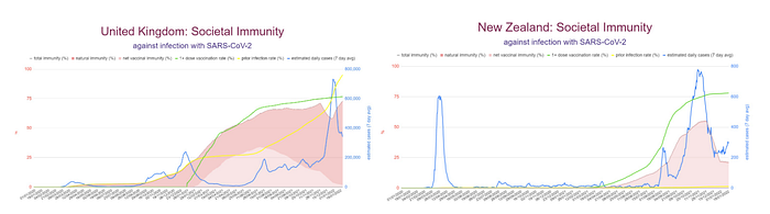
United Kingdom vs. New Zealand
To see more examples, and to learn more about the basic ideas behind the model as well as its limitations and shortcomings, check out the various sheets in the template.
To edit and add data to generate charts for alternative assumptions and for other countries, make a copy of the template and use that copy to edit.
Questions, comments, suggestions etc are welcome at kmswinkels@protonmail.com.